Paper
- HEX
- #FFFFFF
- RGB
- 255 / 255 / 255
Light background
Our identity, in one place. Use these assets and guidelines when featuring The Latent in articles, websites, presentations, and other communications.


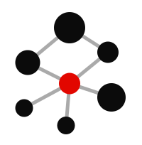
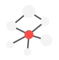
Our symbol connects a network of ideas around a single point of focus. Precise circles and straight connections reflect how we cover artificial intelligence: finding the signal, connecting the facts, and bringing the bigger picture into view.
A consistent identity makes The Latent recognizable wherever it appears. Give the logo room to breathe, preserve its proportions, and choose the right version for your background. Use the files in this kit for every application.
Keep a clear area around the artwork at least as wide as the largest circle in the symbol. This distance is shown as x above. Keep text, images, and other logos outside that space.
Use the full lockup at 160px wide or larger. In compact spaces, use the symbol on its own at a minimum width of 32px. Always check that the connections remain visible at the final size.
Use the dark artwork on a light background and the light artwork on a dark background. Keep the central node red. Every downloadable logo has a transparent background; the panels here demonstrate the intended contrast.
Do not stretch, rotate, rearrange, or recolor the logo. Avoid shadows, outlines, gradients, and busy backgrounds. Keep the symbol and wordmark in their original proportions, and use the supplied artwork instead of retyping the wordmark.
Light background
Primary ink · dark background
Light-mode accent
Dark-mode ink
#F4F4F5Dark-mode red
#FF4D45Connection Gray
#AAAAAADark connections
#5D5D5DThese are the website’s sRGB colors. The light logo retains its supplied artwork colors: #0B0B0B and #E20700. Use the downloadable files to preserve them.
Clear, direct, and built for reading. Our typography pairs a practical sans-serif foundation with bold editorial headlines and a restrained serif accent.
Body copy & interface
Regular · Medium · BoldThe signal in AI.
ABCDEFGHIJKLMNOPQRSTUVWXYZ
abcdefghijklmnopqrstuvwxyz
0123456789 & @ % ! ?
IBM Plex Sans → Segoe UI → Helvetica Neue → Arial. The website uses the first available local font.
Editorial headlines
Black / 900Intelligence.
In perspective.
System UI sans-serif, with tight spacing and a strong, compact line height.
Editorial accents
Regular · BoldA closer look.
Used for article drop caps and Learn path headings. Times New Roman and the system serif provide fallbacks where configured. Podcast cover artwork also uses IBM Plex Serif, with Georgia as its fallback.
Data & reference labels
Regular · SemiboldAa Bb Cc / 0123456789
Chart reference labels use IBM Plex Mono when available, then system monospace. Brand utility labels use the system monospace stack.
Fonts are supplied by the reader’s device; the website does not download or bundle font files. “Latent Sans” is the name of our local font stack, not a separate typeface.
Arabic: Segoe UI, Tahoma, Noto Naskh Arabic, Arial Unicode MS. Simplified Chinese: PingFang SC, Hiragino Sans GB, Noto Sans SC, Microsoft YaHei. Japanese: Hiragino Sans, Hiragino Kaku Gothic ProN, Noto Sans JP, Yu Gothic. Korean: Apple SD Gothic Neo, Noto Sans KR, Malgun Gothic.


SVG for scalable artwork. PNG for everyday use. All logos have transparent backgrounds. The complete package includes both versions, color tokens, and a usage guide.
For brand use and partnership inquiries, contact partners@thelatent.co.
![[ PNG ]](/brand-kit/the-latent-lockup-dark.png)
![[ PNG ]](/brand-kit/the-latent-lockup-light.png)
![[ PNG ]](/brand-kit/the-latent-symbol-dark.png)
![[ PNG ]](/brand-kit/the-latent-symbol-light.png)
![[ PNG ]](/brand-kit/the-latent-wordmark-dark.png)
![[ PNG ]](/brand-kit/the-latent-wordmark-light.png)